Thursday, January 16, 2014

The Heart of the Home, The Pain in the Ass.

I couldn't wait to get my hands on these cabinets ever since we moved in. I believe my eloquent words were, "i can't wait to renovate the shit out of this kitchen." 
The first step was to paint it (and decorate it for Christmas):
The next step was to get into a month-long debate over how it should look, which i ultimately won. (Chris was rooting for all espresso cabinets, which i thought would sink the whole house when you took into account that our floors will eventually be a darker walnut color.) Here was my plan:
Preparation is the worst step. Worse than clean up. I removed all the hardware with my tool of choice:
(At least he has a great personality?)
Cleaning was another part of prep. I had to get at the cabinets and literally scrape the sludge off the quarter-rounds, which had obviously never been done.
And, yes, we're taking the quarter-rounds into account. Why are these always the same color as the floor instead of the trim or the structures they surround?? My head hurts with all of this nonsense.
 If i look at the pictures below for too long, i get hives.
With everything prepped, we're ready to take the first step. We decided to go with Rustoleum's Cabinet Transformations - Espresso for the island and white for the cabinets. Step 1 is deglossing, which is supposed to replace the sanding part of a normal renovation. You do just as much work but instead of choking on sawdust, you're inhaling a very low-odor chemical. I don't need to know long division, anyway.
The second step was to put on the base coat, which is a water-soluble paint and primer combo. The espresso went on great, and here's what the island looked like after one coat:
 ...and after the second coat it was pretty solid:
Quick Tip: Don't touch the base coat even after its dry. It shows ANYTHING that touches it, including a huge white line (?) when your 3 year old drags a finger across the entire broad side. Trying to wipe the marks off will make it worse. Needless to say, that section has three coats.

So the island was going great. The cabinets, on the other hand, were not going so well. I don't know why the Rustoleum white was so awful, but this is after the first coat (and the realization that the caulking adhering our granite to the cabinets wasn't the paintable kind... i eventually used a blade to trim that back) and it looked like crap. The brush strokes were painfully obvious (the directions in the pamphlet advised against rolling for some reason?) and it was going to be at least four coats to get it looking solid, for which we didn't have the time, patience, or paint.
We also noticed that there were pretty serious cracks in between the walls and the cabinets...
 We quickly caulked those...
 ...and moved onto a paint that we know could do the job:
After lightly sanding the painted cabinets (damn you, Rustoleum, we had to sand anyway!), Chris went to work.
Two coats later with a quality smooth roller - not paintbrush because we don't want brush strokes, Rustoleum, you jerks - and the white was looking much sexier.

Moving on to the last step (we skipped the decorative glazing step as the difference with such a dark color would be minimal if at all, and we were more than happy with the color) of the Rustoleum Cabinet Transformations for the island...
It's a Protective Top Coat. (Read: really low-quality poly-acrylic.) If i'd remembered that i had some very high quality poly-acrylic left over from my banister project, i would have grabbed it. But i didn't sooo...i dealt with this crap. It only worked because i'm good with a paintbrush. It looked like this after i finished:
Here's what the kitchen looked like with everything painted and waiting to dry so it could be put back together.
AND DRY IT DID! No need to look at internet porn today, my friends, when you can look at these sexy cabinets WITH hardware. Hubba!
Now, obviously we have touch-up to do as with every project. For example, when we painted the cabinets, we were unable to tape the wall because of the caulk job (heh) we did on them. That'll have to be done this weekend when the paint is fully dry.
You know, the new colors don't make me hate the counter tops as much...
 You may have picked up on the brown color that's been left in the kitchen and of course we're doing a backsplash. We're currently in the debate part of this project, but these are our top two contenders:
Stay tuned for that huge mess.

Here's where i'll leave you:


"That one was much better." - JD

 **Huge thanks to my sister, Lala, who spent her time helping with the kids so we could get this done!!**

Tuesday, January 7, 2014

Guesting Game

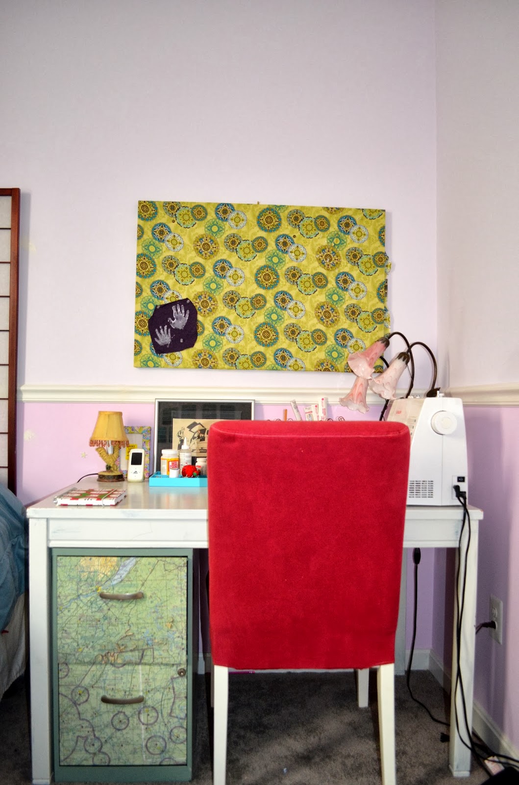
Want to know what i did at the beginning of December? Had five daiquiris. I also made over the guest room. Our tiniest bedroom that fits a queen bed and little else. Here's a look around of how it looked before:
I ultimately had to dismantle that desk and put it under the bed for storage. It's just too big for the space. Until i have my own official sewing table, i'll just have to cart everything to the dining room table. The filing cabinet (used for crafty storage) is now in the closet.
We found the dresser below in the garage when we bought the place. It was a new Ikea MALM dresser, which happens to be the same kind we already have for both kids, just in different colors. And as we're in the process of making some changes in Daughter's room, i switched out her dresser drawers for the "new" color (pics of the other dresser will come with her room reveal). Here's how it looks on this dresser:
That was our guest room. A purple-on-purple room that, when we moved in, had no overhead lighting and a chair rail. Which one of you will be the one to explain why there's a chair rail in this room? Did the former owners have fancy dinners in here? Now, i do realize that my daughter's room currently has a chair rail and it stayed for two reasons: 1. Because we were in a rush to get in the house and painting was the extent of the time we were willing to spend on it and 2. because it's big enough to have a chair rail for decor instead of function. In my opinion, splitting such a small room in half makes it look even smaller. 

The first step was to rip it off the wall with a box cutter (score it) and a hammer (pry it).
 Afterward, i had to get at it with a scraper to peel off the caulk that was stuck to the wall.
After scraping comes the spackling. And i'm talking thick spackle...it was ridiculous. I'd spackle, spackle again, sand, then spackle one more 'gain, then sand one last time.
Once the room was prepared, it came time for the best part: picking a color! I thought for a minute i'd be super rebel and go with a jewel tone as those seem to look best in smaller rooms. Then i remembered that i kind of hate our jewel-toned dining room. It makes me feel uneasy and i don't like being in there, but i DO like waking up to thunderstorms (fun fact), so i'd go with something storm-cloudy. I picked Behr's Rocky Mountain Sky. It's pretty much one shade darker than the master bedroom  -Valpar's Gravity, which is almost exactly like Behr's Light French Gray.
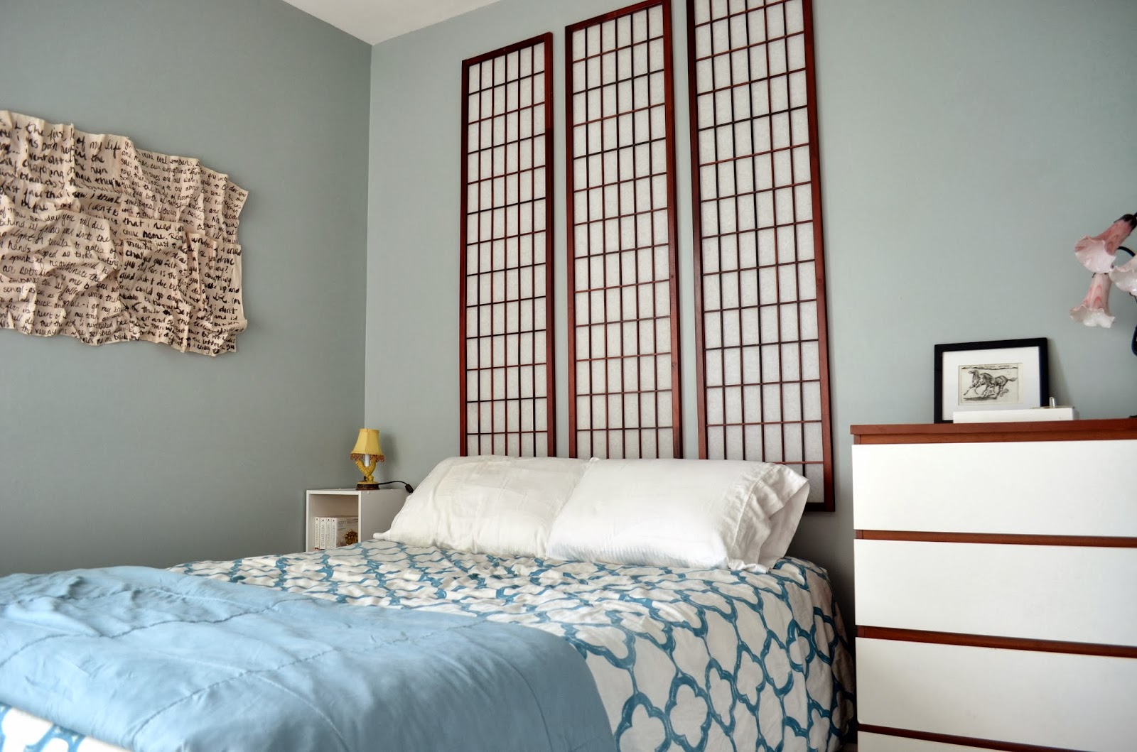
After only an hour and a half of painting and an hour and a half of trimming the next day, Chris offered to hang the room divider on the wall over the bed as opposed to having it just sitting behind the bed like so:
The first step was to remove the hinges that held it together:
 The second step was to involve this sexy little canister:
 ...which helped make these holes...
 ...a tiny bit less noticeable.
 Step three: hang 'em.
I also moved the bed over so there's floor access on both sides, and put in Daughter's old bookcase as a nightstand. The room still isn't finished as we need a window panel (which i'll make) and a few mirrors to get it to be where i think it should be. But here's where the room ended up:
I'm currently on the hunt for a mirror that can go above the dresser. And here's a close-up of some of the artwork. This is a VW ad i found in a magazine in college that i outlined with some color. It hit pretty close to home and reminds me of good times with my roommates and i'll never throw it away...never ever.
Chairs in bedrooms are never really used for any other purpose than as a catch-all. And i will eventually put a large mirror on the lightswitch wall near the chair.
Extreme close-up! Some artist in Myrtle Beach is $20 richer for this completely inaccurate caricature, but it reminds us of good times.
 This is the view from the bed. I thrifted that clock for $3. High five, Self.
That piece of trash on the wall is actually something i made. I took some wrapping paper - the kind you get at the store when you buy fragile things - and used black acrylic paint to paint on the lyrics of two of my favorite romantic songs. The songs are on two sheets each, and those sheets are diagonal from each other. I hot glued them in a wrinkly fashion to a piece of euca board, then mod podged the whole thing after the fact. So it feels more like plastic than it does paper, and will hopefully hold its shape and not yellow.
 
I'll leave you with these Before & Progress pics: